Brand Guidelines
Our brand is more than just a logo or a colour palette — it represents who we are, what we stand for, and how we connect with the communities and people we support. These guidelines exist to make sure our message is consistent, clear, and recognisable wherever it appears.
Our Identity
Verto Living is built on values of care, stability, and growth. Every element of our brand should reflect these principles, whether it’s a printed leaflet, a social media post, or the way we communicate in person.
Logo Usage
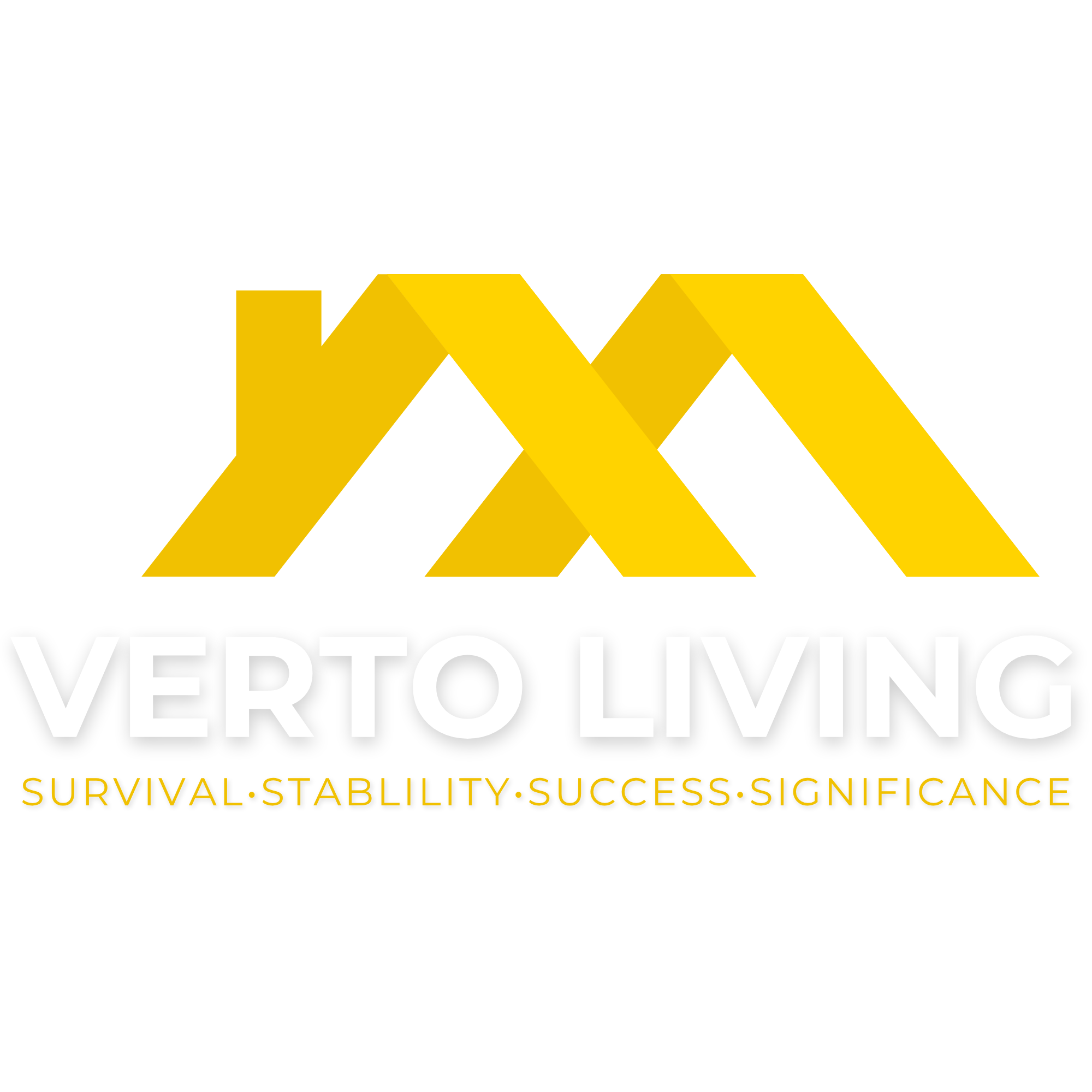
Our logo should always be displayed clearly and respectfully. It should never be stretched, distorted, or placed on backgrounds that make it hard to read. Where possible, use the full-colour version on light backgrounds. A white or single-colour version may be used where appropriate.
Colours
Our core colour is mustard yellow, representing warmth, optimism, and strength. Supporting colours are used sparingly to keep our look clean and professional. Always prioritise accessibility and clarity when combining colours.
Typography
Our chosen fonts are simple, modern, and easy to read. They should be used consistently across all communications to create a unified look and feel.
Tone of Voice
We communicate in a way that is:
Clear and direct – avoiding jargon and unnecessary complexity.
Compassionate – respectful and empathetic, reflecting the work we do.
Professional but approachable – striking the right balance between authority and warmth.
Imagery
Our photography reflects real life — supportive relationships, positive moments, and community spirit. Images should be authentic, inclusive, and aligned with our values.
Why It Matters
Consistency builds trust. By following these guidelines, we ensure that everyone who encounters Verto Living — whether online, in print, or in person — has the same clear and positive experience of our brand.